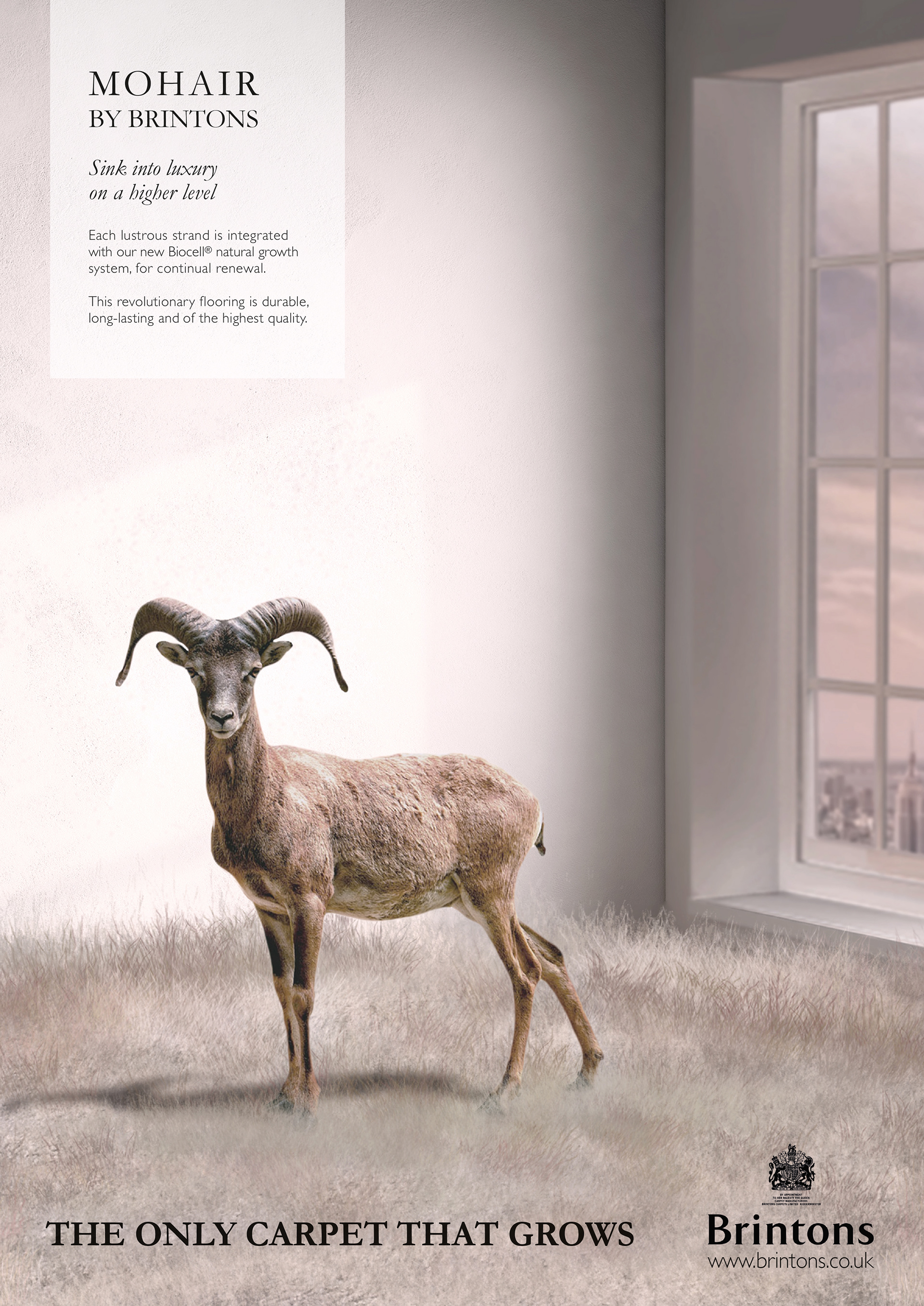
Brinton's April Fool advert.
Brief: Create a print-based advert on the edge of plausibility for an April Fool’s Day advertisement. Use wit to increase awareness and to use a creative concept as standalone or part of a series, all in keeping with the styling of the brand.
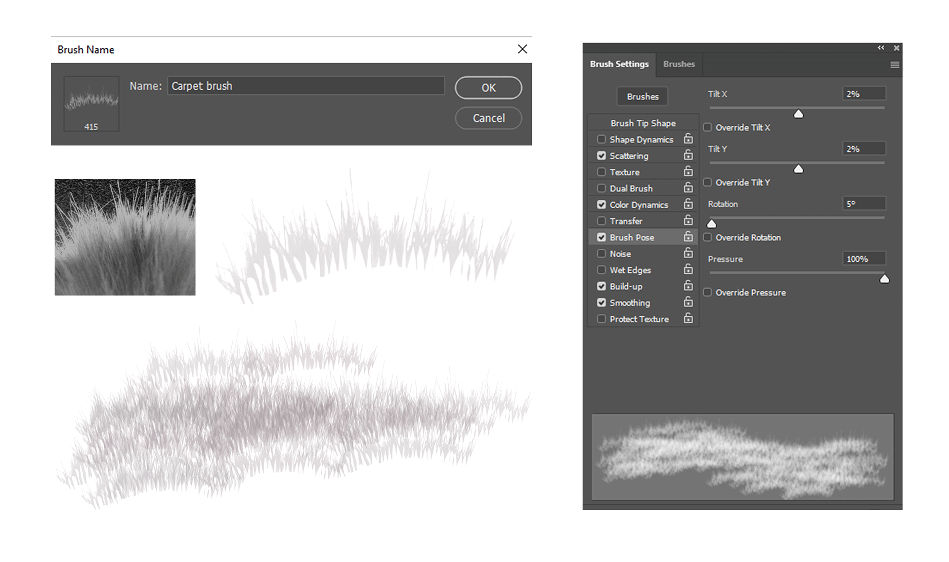
As part of my coursework creating this advert allowed me to develop my editing skills to manipulate photographs. During this project, I utilised various techniques such as layer management, filter adjustments, brush tools, masking, blending techniques, and gained an understanding of colour balance, which are essential for creating a visually appealing composite from multiple photos.
The viewer is presented with an unexpected sight: a goat in a high-rise interior, surrounded by unexpectedly long carpet fibres. The juxtaposition of the animal in this sleek and modern space creates an interesting visual contrast that captures the viewer's attention. Meanwhile, the tall city buildings in the background suggest a premium urban lifestyle associated with the brand.
Throughout the design process, careful consideration was given to which design elements to include and which to leave out. Ultimately, a minimalistic approach was taken, resulting in a powerful and impactful image that effectively communicates the desired message to the viewer.
The project also reinforced the importance of precise copywriting. It taught me the value of balancing creativity with meeting client requirements and ethical standards. To cement my idea of a growing carpet, I explored genetic engineering and hair cell growth. This combination resulted in a plausible scientific explanation for a bio-cellular carpet concept to convince the audience. The significance of the product was emphasised in the copy by adding a scientific name, "Biocell", with the addition of a Registered trademark symbol adding importance.
Working with five photographs with varying size, resolution and perspective presented a challenge. I used Photoshop's perspective grid to estimate vanishing points and ensure the composition was unified.
The typography was chosen to align with brand tone and personality. The colour scheme was carefully selected to blend earthy natural tones with a sophisticated neutral interior while maintaining a cohesive brand identity. The muted, calm colour palette enhances the sense of authenticity.
I enjoyed the freedom to explore a creative solution beyond typical constraints and the challenge to create a visually compelling and witty message in line with Brinton's quirky style.
Did you get the joke? Let me know in the comments.
Grade achieved: Distinction